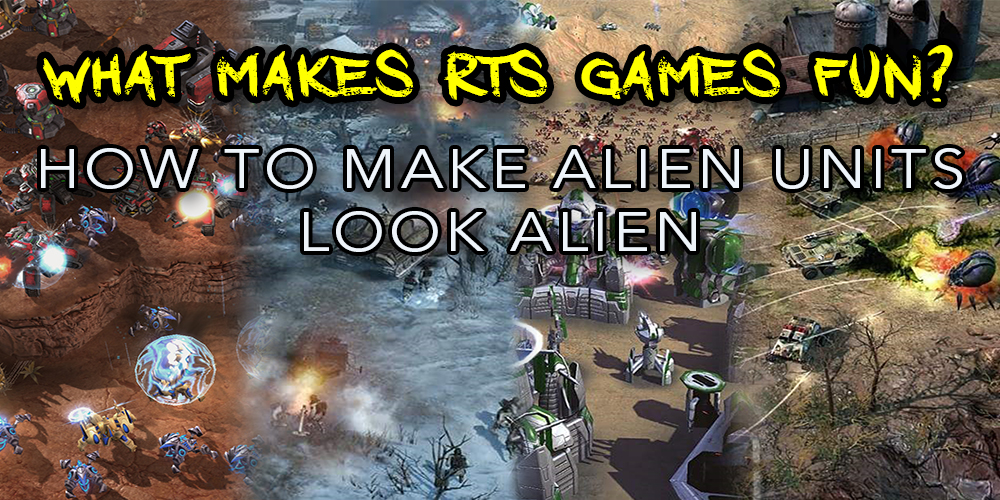
Art design is one of the many components of video games that are subconsciously appreciated but rarely expressed and understood. If a game’s art direction works, it just works, and the player isn’t required to dwell on it. I had little regard for visual unit design until I started as a designer on Ashes of the Singularity: Escalation, where I am now required to be cognizant of the many subtleties of game design which gamers take for granted.
It’s challenging to take a unit design from my head and communicate it to an artist to replicate, as it requires a thorough comprehension of a faction’s recurring visual themes and quirks, and doing so has given me a new appreciation for the art design in many RTS games. Today I’ll be exploring how the Seraphim and Substrate factions from Supreme Commander: Forged Alliance and Ashes of the Singularity: Escalation are crafted in a way to visually distinguish them as alien compared to the other human factions.
Don’t Meet Expectations
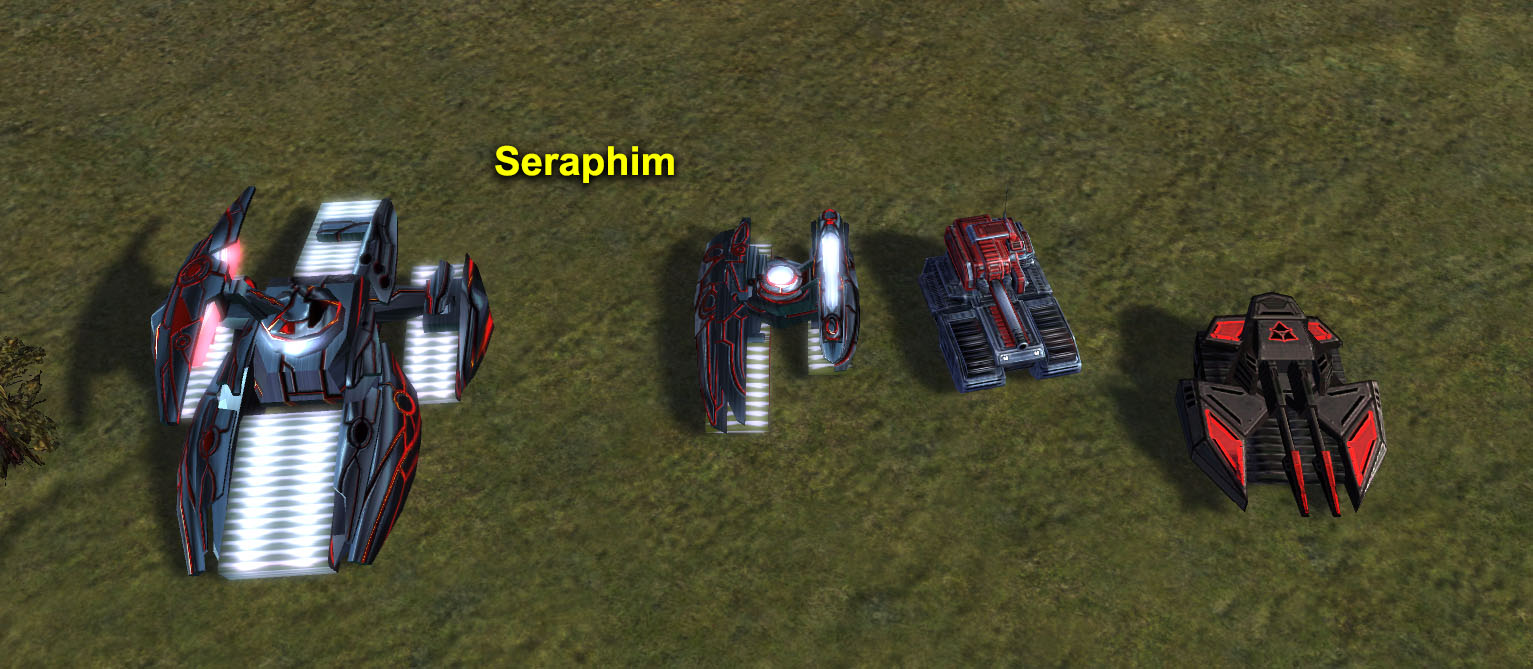
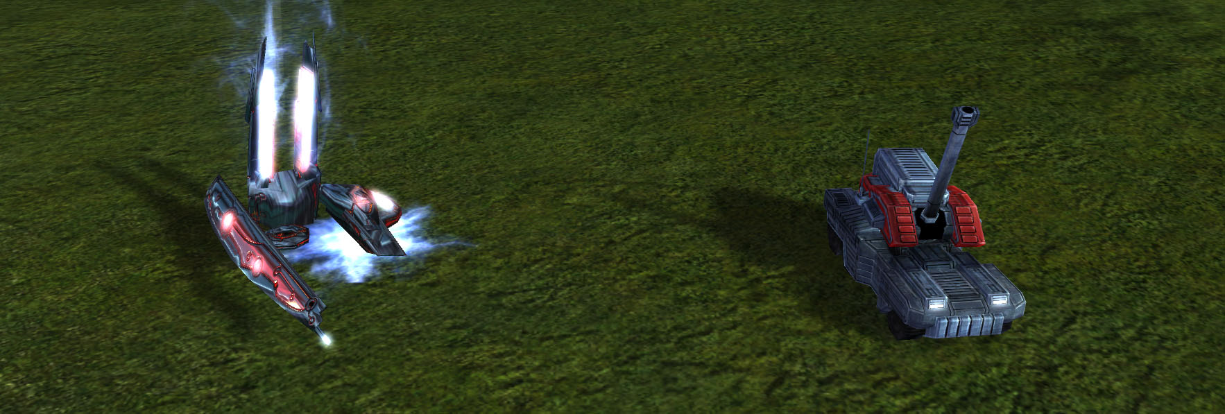
We all have an idea of what a tank should look like; a rectangular frame, a track on each side, and a turret in the middle. For something to look alien, it needs to oppose the image that pops up when you think about a unit type. The Seraphim tanks are unusual as they have their main gun off to one side and have unconventional tracks. The light tank has its right track larger than the left, while the siege four separate tracks, with the front and back differing in wideness.
Don’t Reflect Earth Biology
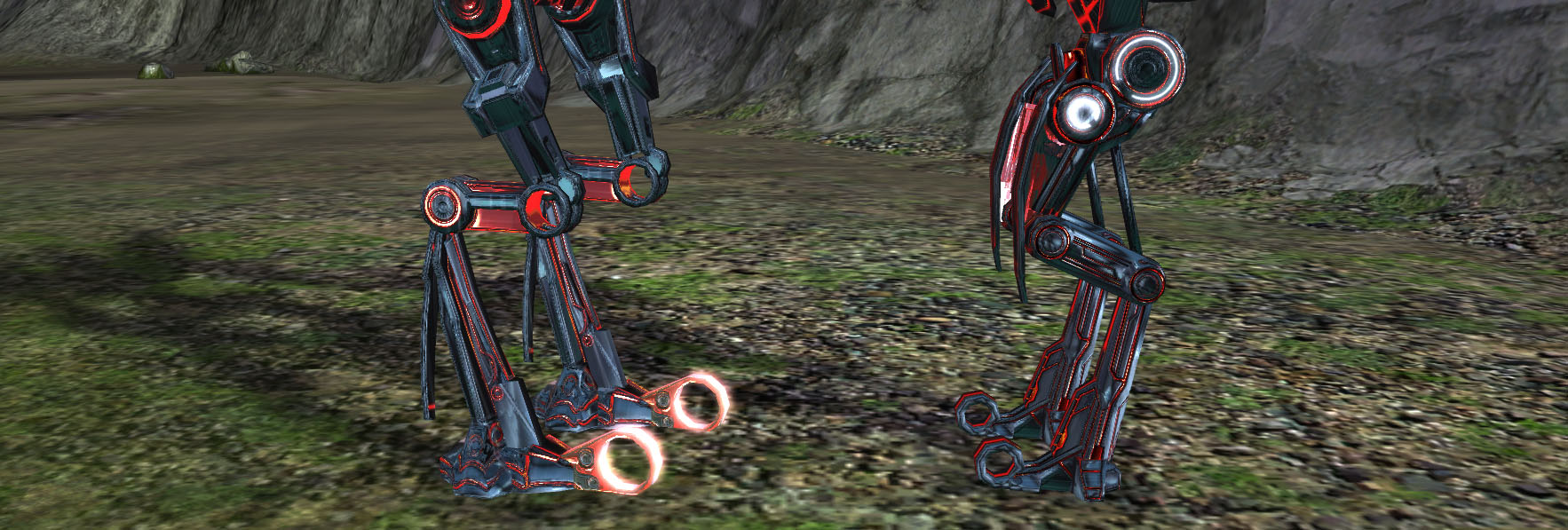
Our expectation of walking robots to match the biology we’re familiar with on Earth. We want our robots to have knees, ankles and feet, and to walk in ways that resembles human movement. Seraphim walkers have multiple means of distancing themselves from a typical walker; some have blade-like legs that look and animate entirely unnaturally.
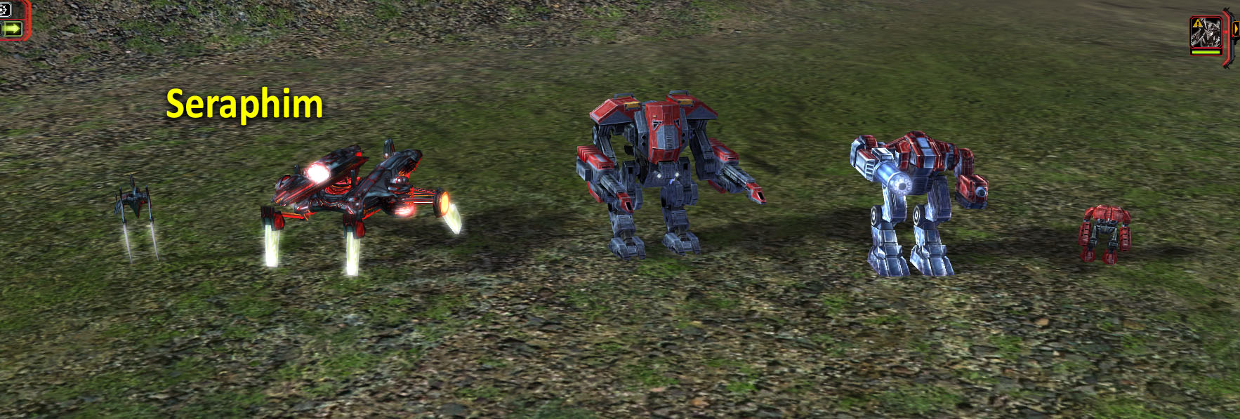
Other Seraphim walkers do have knees and feet but have an additional leg segment, breaking the leg up into 3 sections unlike anything in the animal kingdom. Humans also like even numbers of limbs, as that’s what we’re used to, so when a walker has 3 or 5 legs it strikes us as very alien and unnatural. The 3 legged alien trope exists for a reason.
Another common factor to distinguish alien technology is when walkers have body proportions very different to what we have as humans. This technique is especially noticeable with Aeon, but also with Seraphim as they have thin legs and joints, unlike the tougher looking UEF walker that resembles a human figure.

Differing Geometry
Substrate units consist of lots of curves with sharp pointed ends, lacking in the flat rectangular surfaces which is typical of their human rivals, the PHC.
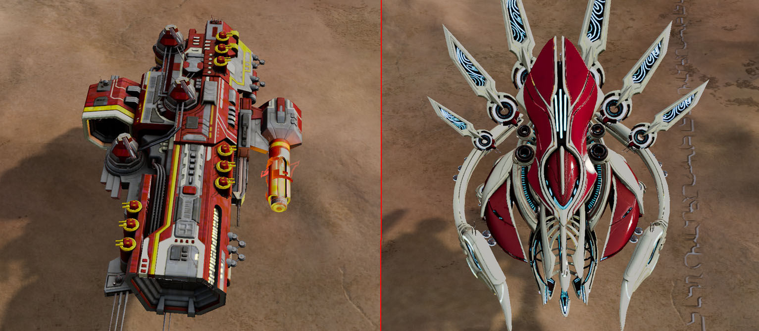
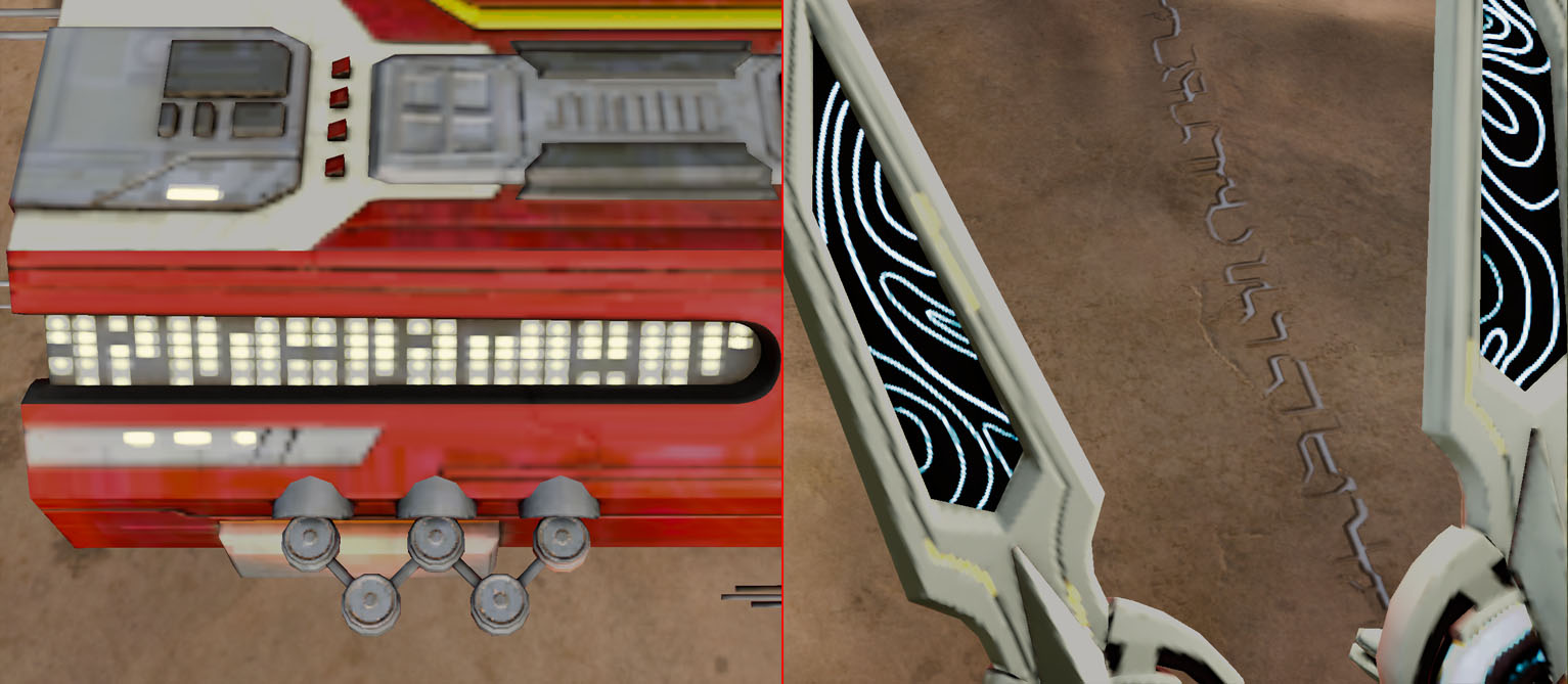
This factional curved/flat dichotomy is found not only in the 3D models but also in the textures. The PHC juggernauts have straight rectangular textures such as light panels and grooves while the Substrate juggernauts have intricate curved patterns.
Strange Weaponry
Seraphim weaponry is very unusual, not just because of the dark mysterious projectiles and effects used, but because of the odd barrels equipped on their vehicles. The Seraphim light mobile artillery doesn’t have a traditional barrel, it resembles a conduit that charges and launches an energy projectile. The weapon is difficult to comprehend; it doesn’t make sense when you look at it, which is deliberate. Alien weaponry should be mysterious, yet the role which the weapon fills should be intuitive. (The upwards trajectory and slow projectile speed makes it intuitive this is an artillery uni.t)
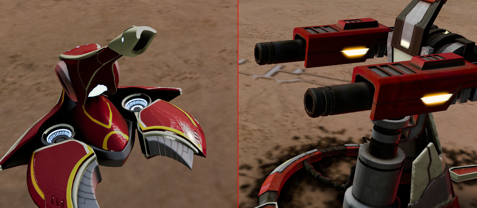
The Substrate shares some of the weapon types used by the PHC, but these alien weaponry have qualities to distinguish them. For example, the Tormentor artillery frigate has a bright fang-like bulb at the end of its barrel, unlike the dark, perfectly round PHC equivalent.
Unusual Texturing
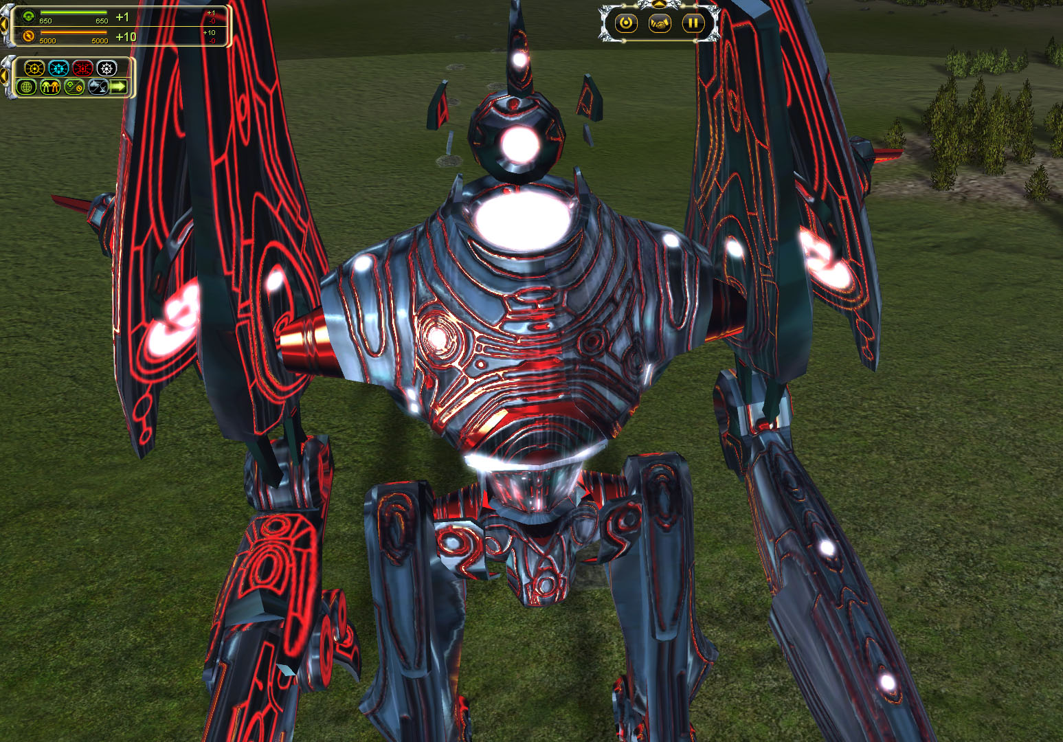
Seraphim textures have a metallic shimmer which suggests the material uses a construction technique unlike what humans use because our metal doesn’t shine. The Tron-like veins throughout are mysterious and indicate some kind of power flow, and the bright lighting in-between joints juxtaposes the darker metallic look, creating a curious effect that’s different to human constructions which have more consistent lighting and tone.
Physics-Defying Floaty Bits
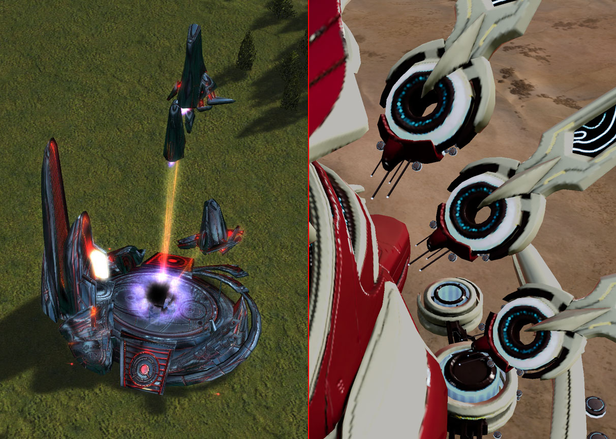
Humans haven’t yet worked out how to defy physics, so typically when there are objects that mysteriously float, it’s non-human technology. Many of the Seraphim and Substrate assets have components not directly connected, floating nearby and moving along with the primary object.
Recurring Characteristics
A recurring feature among many Substrate units are the two pincers at the front of the unit. Reusing a common trait is useful for making units blatantly belong to a specific race, especially when the unit type offers less artistic flexibility.
Colour Palette
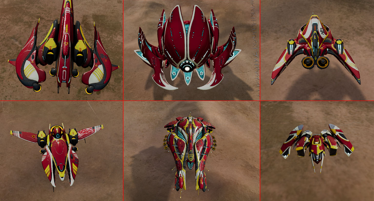
Regardless of the chosen player colour, there are colour palettes typical of each faction. The PHC units have lots of silver to represent the sturdy metal that makes up their constructs and reflects the tougher nature of their gameplay. Substrate units have sections of fluorescent aqua which represents their technological prowess.
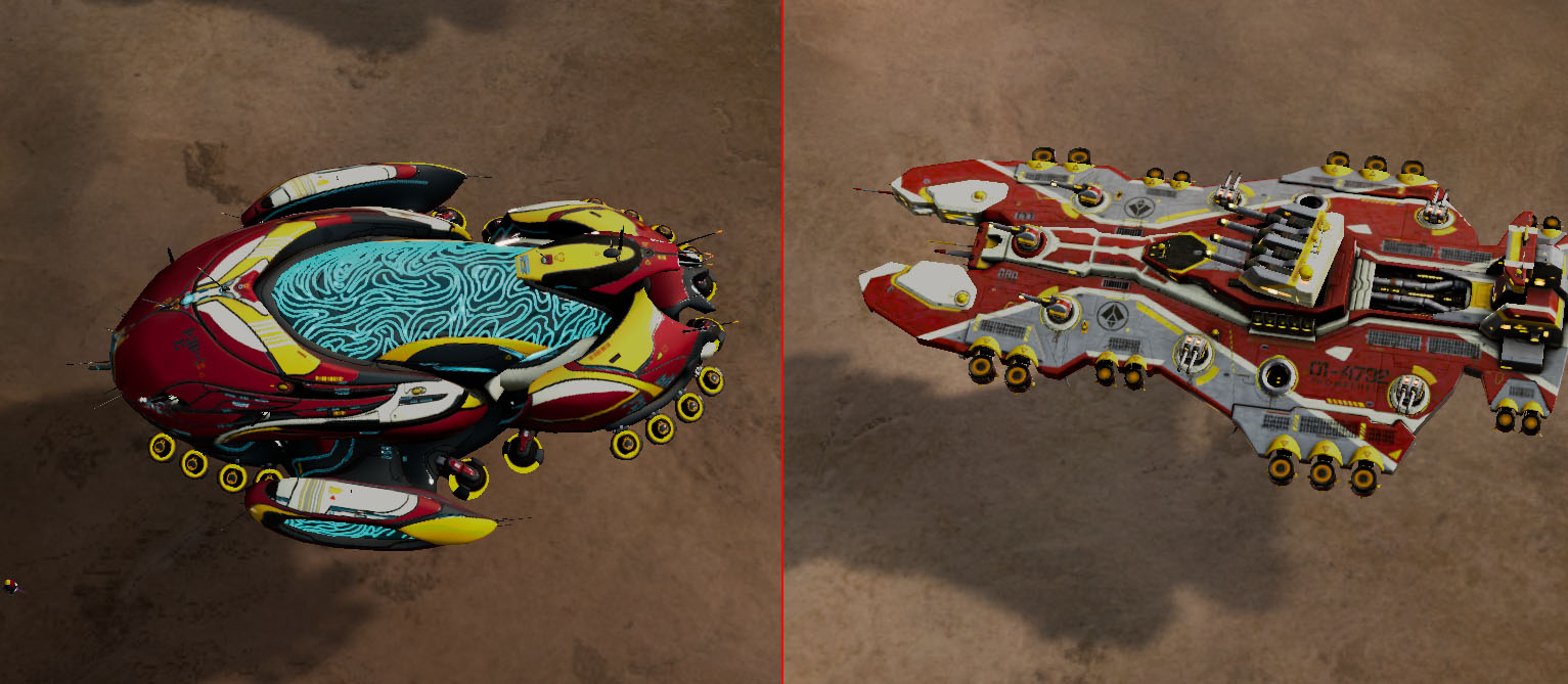
Colour palettes and lighting styles can also extend to weaponry, allowing for easier readability of combat. For example, Substrate has some unique fluorescent weaponry while PHC has lots of orange rocket projectiles.
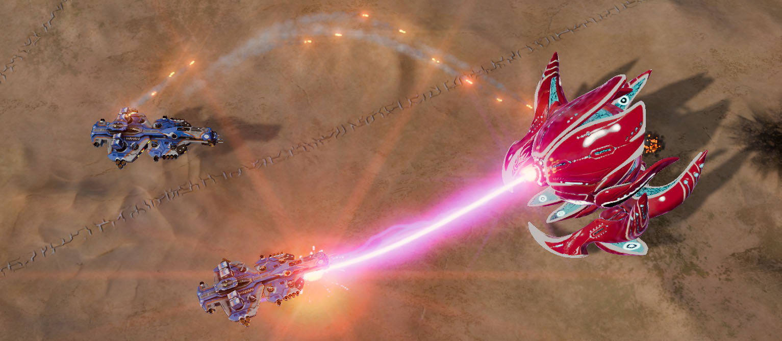
Due to the meticulous art direction in distinguishing these factions, people who haven’t played either game could identify Seraphim and Substrate as alien, as different as they are from each other. Readability and differentiation is a crucial part of good, intuitive RTS design, and being able to comprehend and articulate the unique features that comprise a faction is a critical component of being a game designer.


